
Project Background
As the organization standardized on modern frameworks (React, SwiftUI, Jetpack Compose), the Manhattan Design System's legacy components became a bottleneck: bloated, bug-prone, and hard to maintain. The solution was composability: breaking monolithic legacy components into flexible atoms that teams could combine as needed, fundamentally changing how over 200 product teams build interfaces
Main Goals
- Rebuild legacy components as flexible, composable atoms consistent across Web, iOS, and Android
- Support adoption with comprehensive documentation
- Implement a robust testing framework to maintain component quality
The Team & My Role
As an Experience Design Sr Associate, I lead the re-architecture of several legacy components from audit through VQA testing across all platforms, collaborating closely with PMs, engineering, design leads, and our ADA Advisor.
Timeline & Process
Research & Discovery
- Auditing existing legacy components to identify pain points and inconsistencies
- Analyzing competitor design systems for best practices
- Reviewing enhancement requests from external teams to surface unmet needs
- Collaborating with product teams to understand their specific use cases
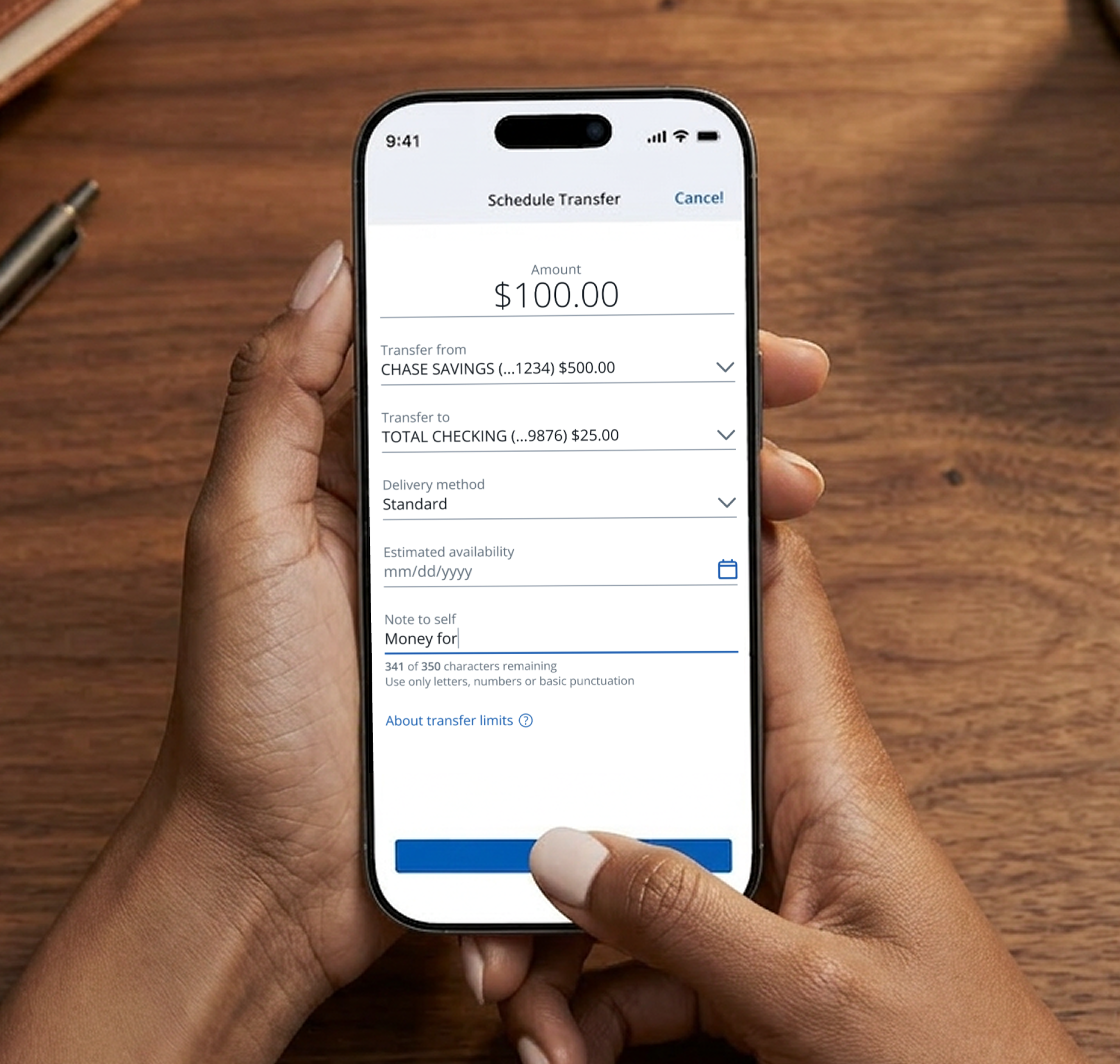
Auditing form elements across Chase revealed that inputs, selects, and datepickers all shared the same structural wrapper. Rather than rebuilding that logic in each component, I designed an input label wrapper for the surrounding context and a flexible input field component that could serve as a text input, select, search, or datepicker so teams could compose any form field without duplicating work
Composition Example
To demonstrate the power of composability, here's an example of a table that utilizes an input field subcomponent for data entry.
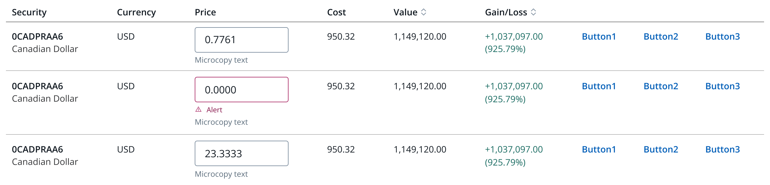
A table utilizing various subcomponents, including the input field subcomponent, showing how composable atoms can be combined to create complex, functional interfaces.
Project Impact
The Composability Initiative fundamentally transformed how Chase designers and developers build interfaces. By breaking down monolithic components into flexible, composable atoms, we created a more maintainable design system that could evolve with changing technology and user needs.
Key accomplishments include:
- Successfully re-architected multiple legacy components for React, Swift, and Jetpack Compose
- Reduced component complexity and improved code maintainability across platforms
- Established a repeatable process for component redesign that balanced design quality, technical feasibility, and accessibility
- Enabled product teams to build more flexible interfaces using composable building blocks
 Back
Back